One of the main questions we posed ourselves in this project, was what was the attitude of participants about the use of AI. We can visualise the behaviour of all participants on the survey tree as we described in the previous blog post. We can achieve that by drawing the arrows with a size that is proportional to the percentage of participants that have chosen that particular answer. You can see how this looks like in the figure below. Note how, since participants shows a great variety in how they choose their answers, almost all the arrows are relevant in the tree. It is a nice visualisation, but is difficult to extract informations and compare different sub-groups by simply comparing the trees.
Normally it is much more useful to have a single number for comparing different groups of participants. So we decided that the right quantity to define, was the “colour” of a participant. Are you more green (positive toward AI), yellow (neutral) or red (negative toward AI)?
In this way we can simply calculate the average of the colours for different groups and compare them. The definition we used is relatively simple. For the 


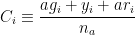
where 

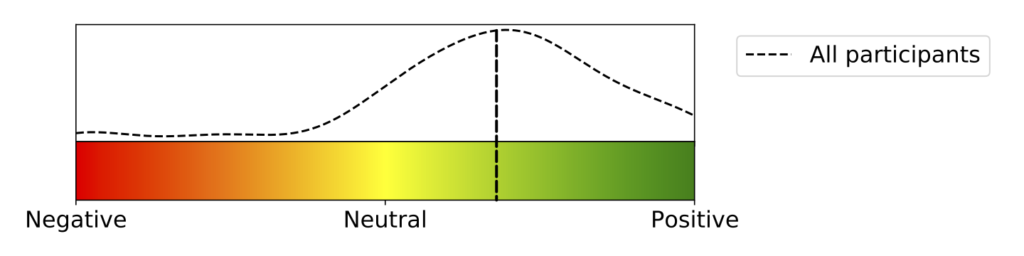
The curve at the top is a Kernel Density Estimation (KDE) [1] of the distribution of the colours for all participants. The reason why we use the KDE instead of a simple histogram, is that it is nicer to look at and gives enough general information while being informative enough. The vertical dashed line indicates the position of the median [2] of the distribution, or in other words it indicates the participant separating the lower half from the top half (in terms of colours). In still other words, 50% of participants are at the right of the dashed vertical line (more positive), and 50% are on the left (less positive). You can see how the tendency between all participants is clearly positive!
[1] https://en.wikipedia.org/wiki/Kernel_density_estimation[2] https://en.wikipedia.org/wiki/Median
If not done already, it’s time to take a ride to the FantasI.A. side !